Creating a Cumulative Expected Goals Timeline - Tableau
Expected Goals have been the first advanced analytics metric to hit the football mainstream. Whether youre catching up with the day’s action on Match of the Day or checking the scores live on your phone you can be sure to be told how many goals a team ‘should’ score in a game. Included below is a mini carousel on the different graphs that you will be able to learn in this tutorial.
To the uninitiated though, don’t worry. I’ve also writted a short article explaining what they are and their usage in football. Check it out here…
All caught up? Perfect, there are several graphics we use to represent a team’s ability to create expected goals.
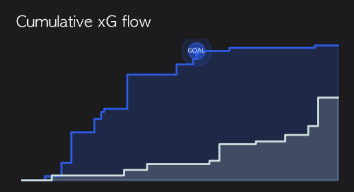
Firstly, what is an xG timeline? An xG timeline shows the accumulation of a teams chance creation across a game.
This can be useful to show which team created more xG overall in the game, an approxiamte size of each chance created and who had been the most threatening team up at certain points in the game.
I’ve included an example from the recent Chelsea vs Leeds premier league match. All credit for this graphic goes to @DataBHJ on twitter who produces these excelletnt graphics for all top 5 league matches.
We can analyse here that Chelsea dominated the first half .After starting poorly Leeds conceded about an hour into the contest before starting to compete for the last third of the match. It would be unfair, however, to suggest Chelsea didn’t deserve the three points in this match. So, onto making it…
The Dataset
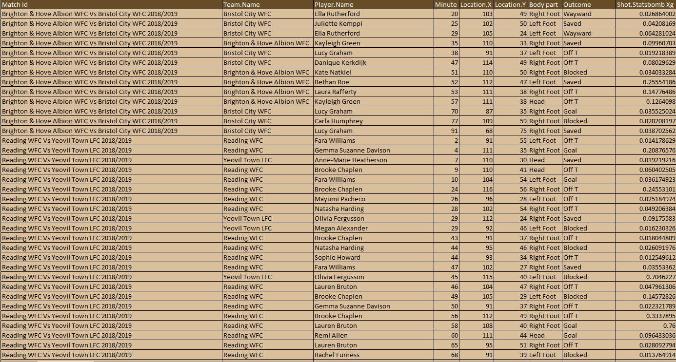
Again step one to any data analysis is getting familiar with the dataset, knowing what each bit of data shows and what you can get it to show is crucial. This is formatted specifically but we will see why in the advanced version of this tutorial
Working within Tableau
Drag ‘Minute’ into Columns
Drag xG into Rows
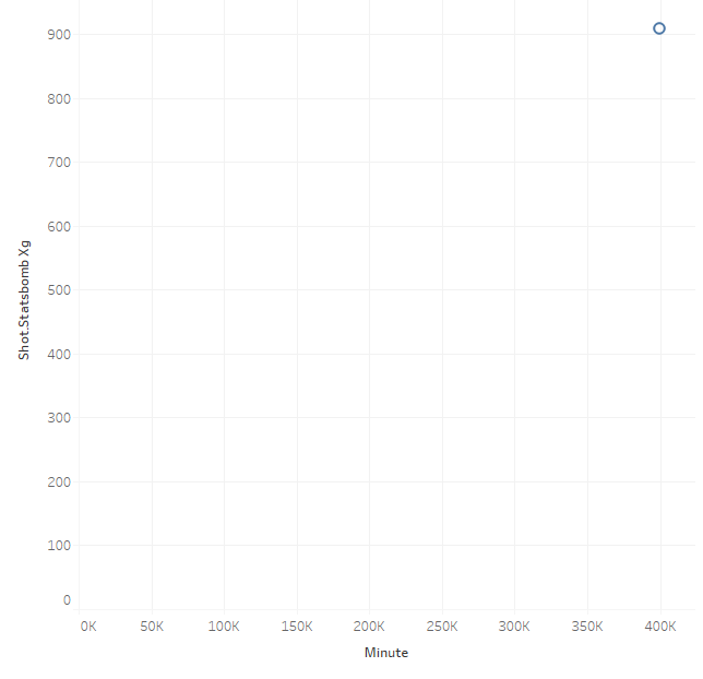
You should now see this view, what you are looking at is an accumulation of every minute value added up and every shot’s expected goals values. This is a simple fix, however, along the top bar if you hover over analysis and deselect aggregate measures.
Analysis - Deselect Aggregate Measures
From here we now need to manipulate our measures. We can do this by right clicking into the measures on the ‘rows’ and ‘columns’ window at the top of the page.
Right Click xG -> Quick Table Calculation -> Running Total
Right Click Minute -> Dimension
Drag Team Name to Colour
Right click Match Id -> Show Filter
After adding the match id filter, clicking the little arrow in the upper right corner of the filter ‘card’ and press single value dropdown.
Click Path and change to the second option.
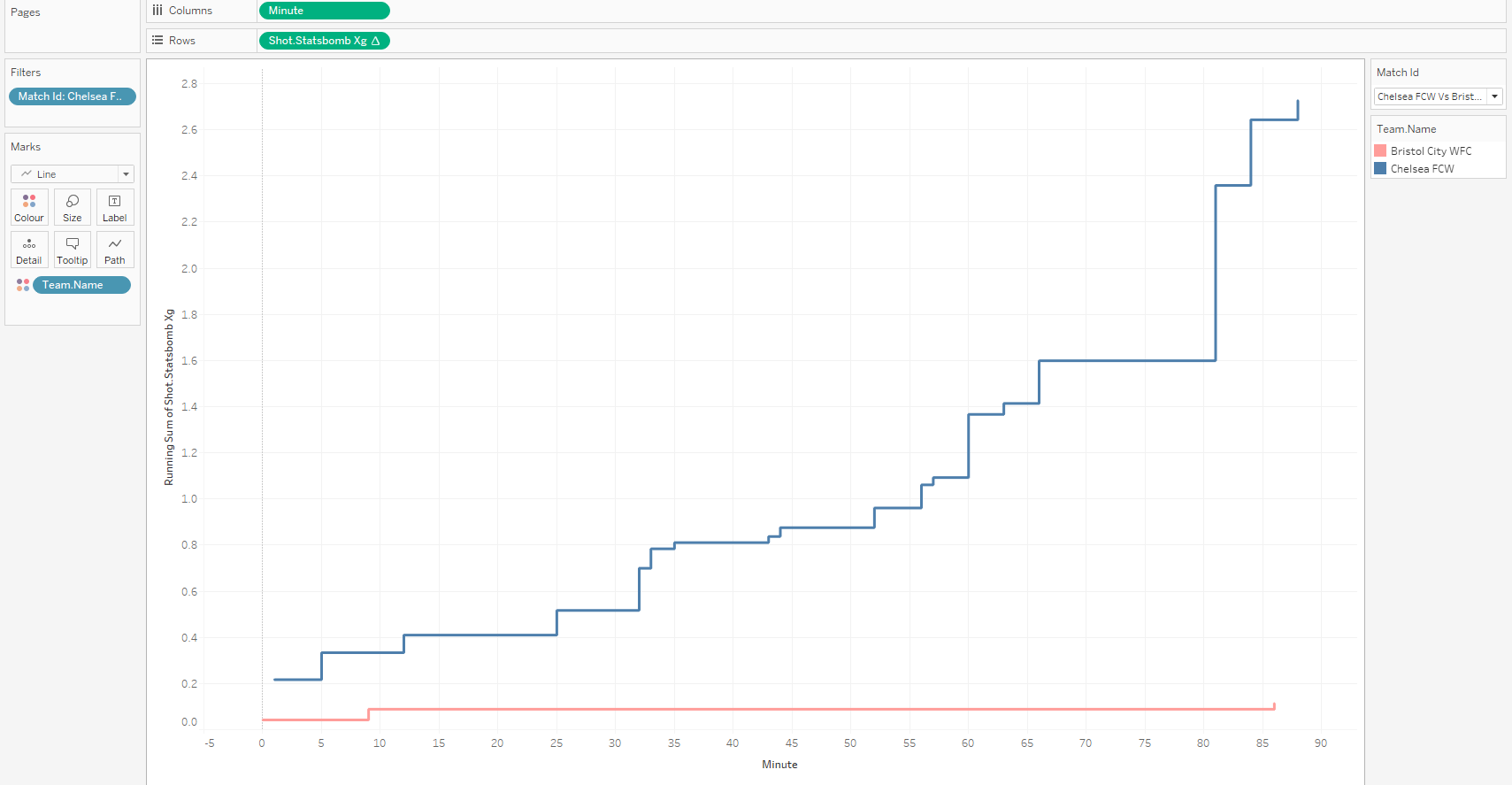
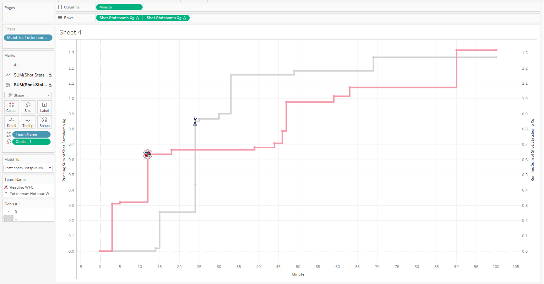
We now have a functional xG flow chart, this can be expanded upon further however if you need an output that works successfully. We can now add polish to this and make it more professional, aesthetically pleasing and readable.
Data Manipulation
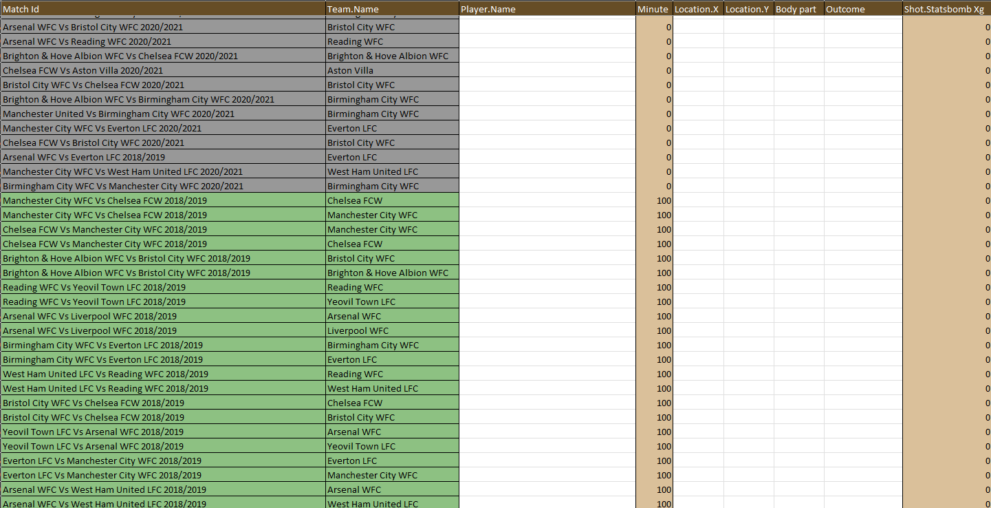
The first problem that has become visible is the graphic is incomplete, it simply startsat the time that the first shot happened and then ends when the last shot happens. A football game lasts ninety minutes though. Unfortunately, I haven’t found a way to solve this in tableau but there is a way by editing the excel file.
What we need to do is add a start and end point for every team for every game. This is easier than you’d think though! The theory here is to create a unique row for each team in every match and then manually add in a 0 xG value in the first minute and another in the 100th minute!
Copy the “Match ID” column and the “Team Name” Column into a new sheet.
Select All Data - > “Data” Tab -> “Remove Duplicates”
Copy This new ouput and paste it back under your first sheet
Add ‘0’ into the Minutes Column and ‘0’ into Expected Goals Column
Double Click the bottom Right of these square to fill all rows.
Repaste the data from Sheet2 underneath that and and ‘100’ into the minutes column and ‘0‘ into Expected goals
You should now see this above data underneath the shot dataset, you can now save and close this workbook. Now, back to Tableau to update the data in Tableau.
Right Click your data set (directly above the search bar on the left of the screen), -> “refresh”
Another thing we can do is show the team logo at the point a goal is scores so we can establish the score at any time in the match.
To do this we need to create a calculation to differentiate between a regular shot and a goal being scored. I created a calculated field ( Analysis -> Create Calculated Field) with this formula
IF [Outcome] = 'Goal' Then(1) ELSE (0) END
This allocates any row where the value inside ‘Shot Outcome’ is a goal as having a value of 1 and any other row having a value of 0.
Now we need to show the goals, to do this drag xG to the right of the graph when doing so a dashed vertical line should appear, drop xG onto this line to create a secondary Y Axis.
In Rows at the top -> Right click the second xG pod - > Select Synchronise Axis
In Rows at the top -> Right click the second xG pod - > Quick Table Calculation - > Running Total.
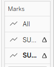
What we have done in those three steps is duplicated our graphic to give us a secondary plane to edit. Firstly in ‘All’ remove “measure names”.
we can now select the secondary plabe by pressing the lower dimension which is in bold in this graphic.
In this lower Dimension, change Line to Shape -> change the colour icon to the left of Team Name to shape and then from here follow the instructions in this tutorial.
Drag your Created Calculated FIeld into Size on the second dimension
Clicking into size will also allow you to change the size of these logos. Set Start Size as 0 and End Size as 1
Your Graphic should now look something like this
Aesthetics
Right Click on the Axis On the right hand side -> remove ‘show header’
Double click the X Axis -> Fixed -> Fixed start = 0, Fixed End = 101
Double Click the Y Axis - > Title -> ‘Expected Goals’
Format -> Workbook / Choose your own designs.
Double click the Title -> Insert ‘ Match Id’
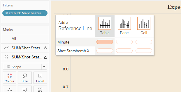
Analytics -> Reference Line -> Table+Minute
Change Average -> Constant -> ‘45’
Label ‘Custom’ --> ‘Half Time’
Feel free to play around with formatting as much as you want and make it as aesthetically pleasing as you can. Ive left mine as this.
