Creating Shot Maps - Tableau
Tableau is becoming an increasingly popular tool for analysing football. The first graphic football analysts learn is usually a shot map, the simplicity makes it easy to see why.
The Dataset
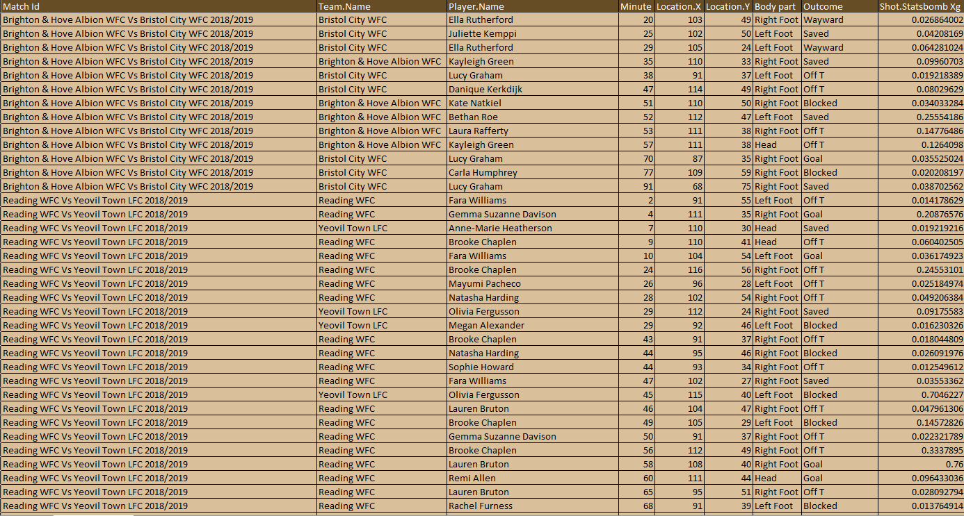
Prior to working on any vizualisations it is essential to understand your data. What does each header mean? What data do you need? What data don’t you need?
I’m using the dataset of WSL Shots from 2018/19-2020-21. In the dataset we see our shot coordinates in the form of X, and Y values. We also have shot information, the shot outcome, and details about the shot taker with the Player Name and Team Name.
Working within Tableau
Drag X - > Columns & Drag Y -> Rows
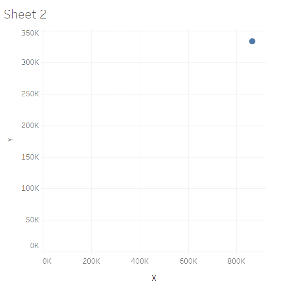
Once you have connected to your dataset in Tableau the first thing to do is drag ‘X’ -> ‘Columns’ and then ‘Y’ -> ‘Rows’. This produces this view. This view shows the point that you would get if you added together all ‘X’ values and all the ‘Y’ values. We haven’t told Tableau what to focus on at the moment so it defaults to adding together the values, This is easily fixed though.
Once you have connected to your dataset in Tableau the first thing to do is drag ‘X’ -> ‘Columns’ and then ‘Y’ -> ‘Rows’. This produces this view. This view shows the point that you would get if you added together all ‘X’ values and all the ‘Y’ values. We haven’t told Tableau what to focus on at the moment so it defaults to adding together the values, This is easily fixed though.
In Analysis - > Turn off Aggregate Measures
This new view shows every shot in the dataset at once, chaotic right? Our job now is to make that data as readable as possible.
Double Click the X Axis -> Change Automatic to fixed -> Set a fixed start and end dependent on your data.
Double Click the Y Axis -> Change Automatic to fixed -> Set a fixed start and end that shows the full width of the pitch.Also, click reversed!
To start with, The range of values used to measure the pitch are 0-80 and 0-120. I have set my Y Axis (Height) to 0-80 and then for the X-Axis (Width) my range is set as 75-120 so it shows the final third. We have to reverse the Y-Axis because 0-0 usually occurs in the bottom left however on a football field we have 0-0 in the top left.
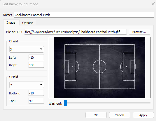
If we know the pitch border values we can add a background to the graphic, this gives more context on exactly where the shot took place.
In “Map” -> “background images”. Set a Background
In order to change the background to include a pitch you can go to “map” then “background images” and select your data source. You can add images. This should allow you to select the columns field and the rows field you have on your viz and then in the left box, you say where you want your photo to start. (I have this at -10,130 & -10,90 as there are 10 metres of area on my background photo outside of the touchline).
Drag Team - > “Colour”
On the right of the graphic a “card” should now appear showing the colours of selected team, if you press the down arrow in the top right corner of this card you will then be able to edit the colours
Change “Marks” from Automatic -> Circle
Drag Match ID - > “Filter “
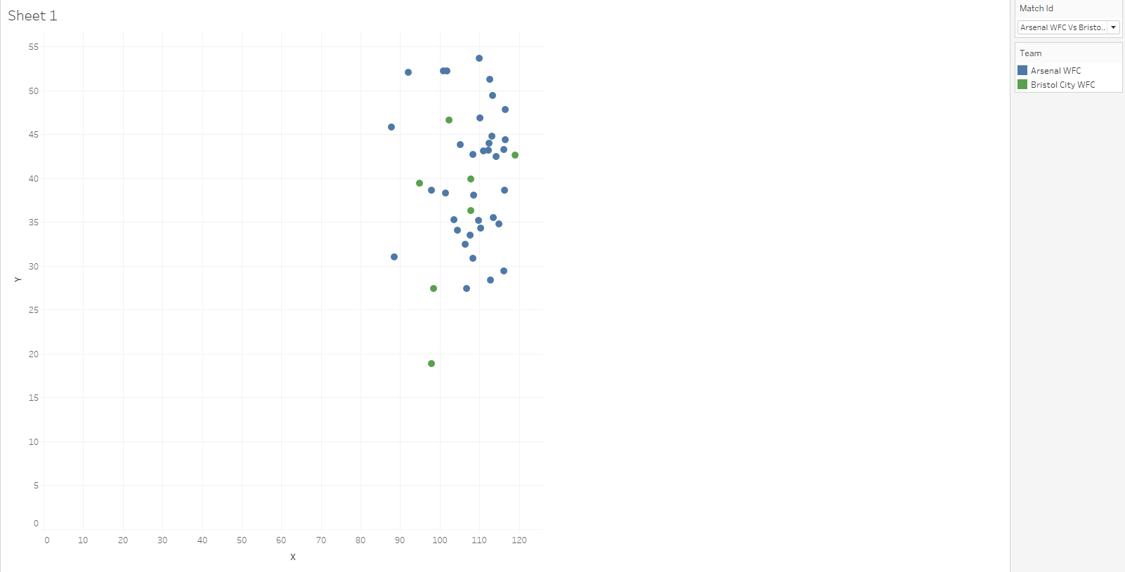
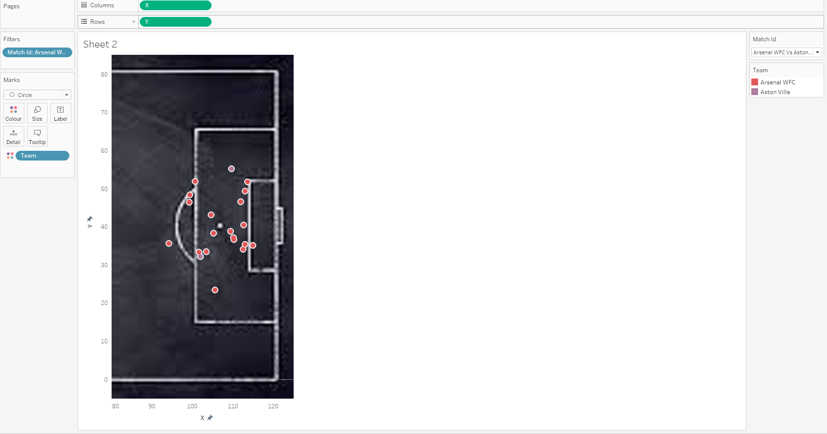
The first big step towards making the graphic digestible is to add Match ID as a filter and select any game, this will filter only to the shots that took place within that match. If you now right-click the “Match ID filter” and press “show filter” the filter appears on the right-hand side of the worksheet.
Clicking the small drop-down arrow in the top right of this view allows us to change the filter to “Single Value (Dropdown)” which will allow you to change the match with ease.
Your graphic should now look like the below, for the intent of producing something, this can be the end, however there are still ways to improve our shot maps and make them aesthetically pleasing and more consumer friendly.
Right-click both axis and take off ‘show header’,
Secondly, by double-clicking on the sheet along the bottom taskbar, we can change the sheet name, in this case, I’ve gone for ‘Shot Map’. This will update the title above the graphic. If we double-click that title a box will appear to edit it . Clicking the insert button then adding the ‘Match Id’ will allow you to dynamically change the title by filtering to a different match.
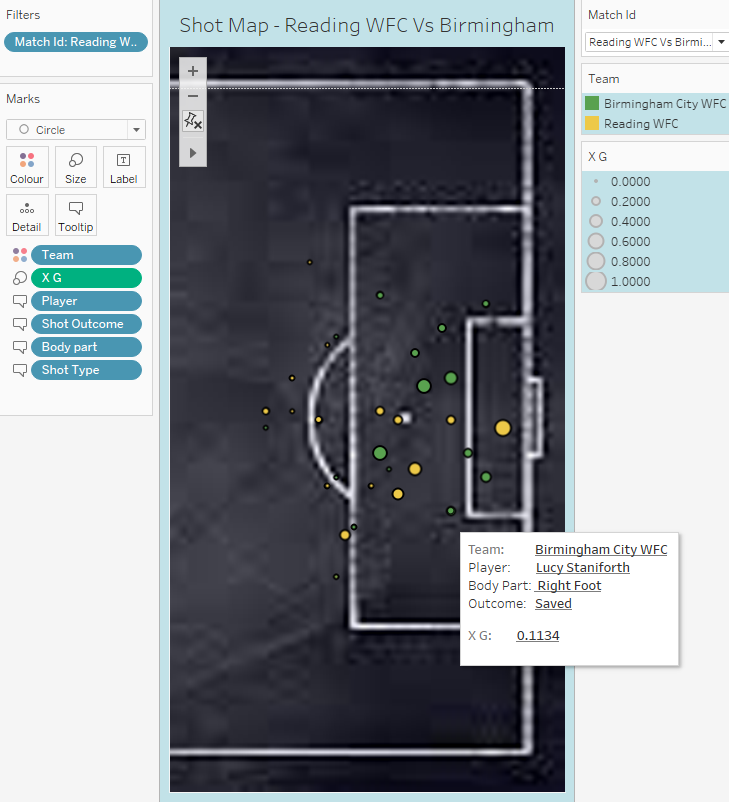
Drag xG over Size.
To calibrate, click the drop-down arrow on the xG Size pop-up(on the right) then set the start value at 0 and the end value at 1.
This gives a consistent scale for xG.
Click Colour and edit the border and halo colour.
Edit Tooltip
Lastly, what is the tooltip? The tooltip is the detail that appears when hovering over a data point. At the moment it will show the team who took the shot, the x coordinate, the y coordinate and the xG.
To input data into the tooltip, drag it into the tooltip tab and it adds it directly to the “tooltip” in “marks”, if it hasn’t , you can add it the same way you added the Match ID to the title.
Within my tooltip, I have attempted to tell the story of a shot with the order showing the big facts right down to the small facts. Within the fine formatting, I have chchosenose to type my labels in the normal text before highlighting the data in bold.
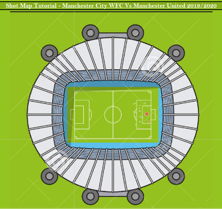
I have applied these principles to a new background which you can see below.
Final Graphic:
